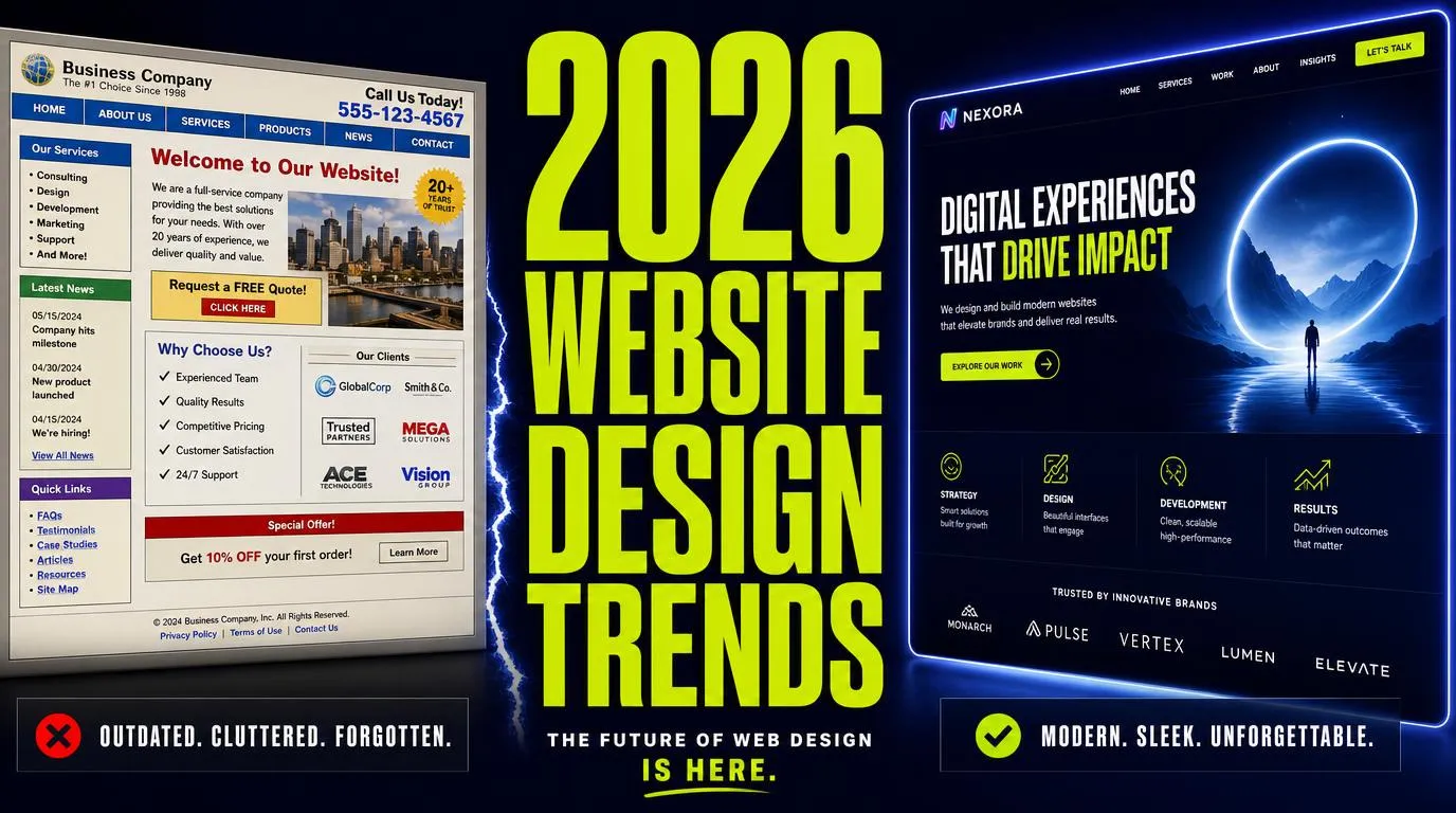
Short answer: The 10 website design trends that actually convert in 2026 are AI-powered personalization, kinetic typography, purposeful micro-interactions, dark mode and dynamic theming, organic shapes and anti-grid layouts, neo-brutalism (for the right brands), accessibility-first design, lightweight 3D moments, variable fonts, and performance-driven design as the non-negotiable foundation. We build all ten of these into our Columbus website design projects — and you can see them live on our own homepage, our med spa, hormone clinic, and HVAC builds. Want the same on your site? Book a free consult or call 614-482-2126.
2026 is the year the "AI-generated website" novelty wore off. Everyone can spin up a template in five minutes now. Which means the sites that actually stand out — and actually convert visitors into booked calls — are the ones that pair *intentional* design decisions with the boring-but-critical fundamentals: speed, accessibility, and structured data.
Below are the 10 website design trends we are actively shipping for our Columbus and national clients this year, with real examples from projects live on our own network. Not every trend belongs on every site — at the end you'll find a decision framework and a 15-question FAQ.
1. AI-Powered Personalization: Sites That Adapt to Each Visitor
Static pages are done. In 2026, the strongest sites treat the interface as a living surface that adapts to who is visiting, where they came from, and what they clicked last time.
How it works. AI reads visitor signals — referral source, city, device, prior page views, time on site — and swaps hero copy, offers, and CTAs in real time. A returning visitor sees a different headline than a first-timer. A visitor from a Google Ad for "botox Dublin OH" sees Dublin-specific proof, not a generic hero.
Real example. On our Columbus neighborhood pages, the hero, testimonials, and service block dynamically re-order based on which neighborhood the visitor lands on — same underlying template, 40+ personalized experiences.
When to use it. Any site with enough traffic to generate patterns. If you are getting fewer than 500 visitors a month, start with simple segmentation (ad-source-based landing pages) before building fully dynamic layouts.
2. Kinetic Typography: Text That Moves With Intent
Typography is no longer a supporting act. In 2026, headlines animate, transform, and respond to scroll — anchoring hero sections and turning words into the visual centerpiece.
How it works. Variable fonts + scroll-triggered animations + light cursor-response effects. Letters scale, rotate, or reveal in choreographed sequence. The eye lands exactly where you want it, in the order you want it.
Real example. Our own homepage hero uses a two-line kinetic reveal — the first line lands, the second line slides in from behind — to force attention on the value prop before any scroll happens. Same technique is live on our AI Website Design service page.
When to use it. Hero sections, section transitions, key CTAs. Never on body copy, never on navigation. If a visitor has to *read* it (menus, forms, article text), stop animating it.
3. Micro-Interactions: Small Feedback, Big Trust
Micro-interactions are the tiny animated confirmations that tell a visitor "the site is alive and responding to you." Hover states on buttons. A checkmark that draws itself on a successful form submit. A subtle underline that grows from left to right on a link. Individually invisible; collectively they are the reason a site *feels* premium.
How it works. Every functional moment gets a purpose-built animation — click, submit, hover, load, transition. Each one lasts 150-350ms, uses ease curves (not linear), and confirms an action.
Real example. On every "Sign Up Here" button across our site, the hover state raises the button, deepens the shadow, and shifts the icon 2px right — a full three-part response in under 200ms. Small, but it is the difference between "someone built this" and "someone cares."
When to use it. Every button, every form, every navigation transition. Skip decorative motion for its own sake — if it does not communicate status, guide attention, or confirm an action, cut it.
4. Dark Mode and Dynamic Theming
Dark mode graduated from "cool feature" to "assumed default" in 2026. The best sites detect the visitor's system preference and adapt automatically, with a manual override for people who want light mode regardless.
How it works. CSS custom properties + a `prefers-color-scheme` media query + a small toggle in the header. Both themes have to independently meet WCAG 2.2 contrast requirements — you cannot just invert the palette and hope.
Real example. The Real Social Company site itself ships in a dark-forward theme (deep charcoal surfaces, high-contrast white cards, primary blue #3B82F6) with light-mode components on cards for readability. Same design system powers our Columbus SEO and Columbus GEO service pages.
When to use it. Nearly every site should offer both modes in 2026. The exception is print-inspired brands (bakeries, wedding photographers, editorial publications) where a light theme is core to the identity.
5. Organic Shapes and Anti-Grid Layouts
Twelve-column bootstrap grids are the design equivalent of a business-casual polo. In 2026, more of the sites we build lean on curves, asymmetry, and flowing SVG shape dividers to feel less mechanical.
How it works. SVG masks between sections instead of hard horizontal lines. Off-center hero images with generous negative space. Rounded card corners at 16-24px instead of 4-8px. Overlapping shapes that break the grid without breaking the layout.
Real example. Our Med Spa Website Design pillar uses curved section dividers and a floating asymmetric hero image — a deliberate softening for a beauty and wellness audience.
When to use it. Beauty, wellness, hospitality, creative, lifestyle. Skip it for finance, legal, medical B2B, and enterprise — audiences there still read curves as "not serious."
6. Neo-Brutalism (For the Right Brands)
Neo-brutalism is the deliberate rejection of polish — heavy borders, harsh drop shadows, chunky sans-serif type, high-contrast colors, no gradients. It is loud, it is confident, and it works spectacularly for the brands willing to commit.
How it works. Bold color blocks. 3-4px solid borders. Offset hard shadows. Fonts with attitude — think Space Grotesk, Archivo Black, DM Mono. Utilitarian layouts that prioritize message over decoration.
Real example. We use restrained neo-brutalist elements — chunky bordered cards, offset shadows, big typography — on our own pricing page to signal confidence and force attention on the numbers.
When to use it. Creative agencies, streetwear, indie tech, bold fashion, hospitality with attitude. Do not use for medical, legal, financial, or any enterprise B2B context where conventional polish is the currency of trust.
7. Accessibility-First Design (Not Retrofitted)
The 2025 WebAIM Million report found that 94.8% of the top million home pages have at least one detectable WCAG 2 A/AA failure — and low-contrast text alone appears on 79% of home pages. In 2026, accessibility is no longer a "nice to have," it is a lead-generation lever. Every visitor you exclude is a booking you lose.
How it works. WCAG 2.2 AA contrast on every text/background pair. Full keyboard navigation with visible focus rings. Descriptive alt text on every meaningful image. Properly labeled form fields. Motion respects `prefers-reduced-motion`. Tappable areas at least 44x44px on mobile.
Real example. Every page on our network ships with a documented color-token system where each token is verified against its background at build time. Our ADA compliance audit service is built directly on top of the same tokens.
When to use it. Always. There is no site in 2026 that should be shipping without accessibility built into the foundation. It is also — quietly — one of the top signals in Google's E-E-A-T framework.
8. Lightweight 3D Moments (Not Full 3D Worlds)
2020-era WebGL hero experiences that took 15 seconds to load are done. In 2026, 3D returns — but as *moments*: a scroll-triggered rotation, a hover-lifted product card, a small floating device mockup, all rendered in SVG or lightweight WebGL that adds under 100KB.
How it works. Compress models aggressively. Lazy-load 3D assets below the fold. Prefer CSS transforms and SVG when they can do the job. Reserve real WebGL for one *earned* moment per page.
Real example. Our Columbus AI Websites service page uses a lightweight 3D-rotated device mockup in the hero — under 80KB, lazy-loaded, and gated by `prefers-reduced-motion`.
When to use it. Product showcases, portfolio pieces, hero moments where the visual payoff is worth the weight. Skip it if it costs you more than 0.3s of Largest Contentful Paint (LCP).
9. Variable Fonts and Bold Typography
A single variable font file now contains the full range of weights and widths a site needs — one HTTP request instead of six. In 2026, that unlocks more expressive typography with *better* performance, not worse.
How it works. One variable font file (Inter var, Space Grotesk var, Manrope var) covers everything from 100 to 900 weight and any width. Combine with fluid type scales that use `clamp()` so headlines resize smoothly between mobile and desktop without media queries.
Real example. Every site we build in 2026 uses two variable fonts total — one for display, one for body — served self-hosted with `font-display: swap`. It is the single biggest typography performance win of the year.
When to use it. Every site. There is no legitimate reason in 2026 to load six separate .woff2 files when one variable file does the same job in a quarter of the bytes.
10. Performance-Driven Design: Speed Is the Foundation
All nine trends above collapse if the site is slow. In 2026, mobile drives 57-59% of e-commerce transactions, and Deloitte's landmark study with Google found that a 0.1-second improvement in mobile load time lifts retail conversion by 8.4%. 53% of mobile users abandon pages that take longer than three seconds.
How it works. Target sub-2.5s Largest Contentful Paint, sub-200ms Interaction to Next Paint, and CLS under 0.1. Ship pre-rendered HTML for first paint. Optimize every image (AVIF/WebP + responsive srcset). Lazy-load everything below the fold. Minimize JavaScript — every KB you ship, the browser has to parse.
Real example. Our own network runs on React + Vite with pre-rendered routes, aggressive code-splitting, and edge-served static HTML. Median LCP on the sites we ship in 2026 is 1.1 seconds — comfortably inside Google's "good" threshold and roughly 3x faster than the average WordPress site we replace. Details on our Core Web Vitals and React vs WordPress SEO pages.
When to use it. Always. Performance is the trend that enables every other trend on this list.
How to Choose: Which Trends Belong on Your Site
Not every trend fits every brand. Use this quick decision framework:
What This Actually Looks Like In Practice
On the sites we build at The Real Social Company, the "trend stack" for a typical 2026 build is: variable fonts, dark-forward theming, accessibility-first tokens, kinetic hero typography, purposeful micro-interactions on every CTA, organic curved section dividers where the brand permits, one lightweight 3D moment on the hero, ad-source and geo-based personalization on landing pages, and performance targets that put us inside the top 5% of Core Web Vitals on the open web.
All of that is included — no upcharges, no plugins — in either our Complete Business Website Design & Growth Special at $300/month or our one-time New Website Design Business Special at $300 build + $100/month hosting.
Frequently Asked Questions
What are the biggest website design trends for 2026?
The 10 that actually move the needle: AI-powered personalization, kinetic typography, purposeful micro-interactions, dark mode and dynamic theming, organic shapes and anti-grid layouts, neo-brutalism (for the right brands), accessibility-first design, lightweight 3D moments, variable fonts, and performance-driven design as the foundation for everything else.
Is dark mode still a trend in 2026 or is it standard?
It is functionally standard. Most users have set a system-level preference by 2026, and any modern site should detect and honor it automatically. Both light and dark variants have to meet WCAG 2.2 AA contrast independently — dark mode does not exempt you from accessibility standards.
Do I really need kinetic typography, or is it just a gimmick?
It is a gimmick if you apply it to body text or navigation. It is a conversion tool when used surgically on hero headlines and section transitions. Anchor the eye where the money is — the first sentence a visitor reads, and the CTA below it.
Will animations and 3D slow my site down?
They will if you are careless. Compressed SVG animations and CSS transforms are effectively free. Full WebGL hero scenes without lazy-loading will destroy your Largest Contentful Paint. The 2026 rule: no animation that costs more than 0.2s of LCP survives the build review.
Is neo-brutalism appropriate for my business?
Only if your buyers already read "bold and irreverent" as trustworthy. Creative agencies, streetwear, indie tech, and hospitality with attitude — yes. Medical, legal, financial, enterprise B2B — no. When in doubt, borrow one or two elements (bold typography, chunky borders) without going full brutalist.
What's the fastest 2026 design upgrade I can make today?
Swap to a single variable font and audit color contrast. Both are near-zero cost and immediately upgrade the site on typography, performance, and accessibility. From there, add micro-interactions on every button hover and CTA click.
How does AI personalization work on a small business site?
You do not need machine learning. Start with rule-based personalization: swap hero copy based on the referring URL, city, or ad campaign. That alone lifts conversion measurably. Machine-learning-driven personalization is worth it once you are past ~5,000 monthly visitors.
Are variable fonts really worth switching to?
Absolutely. One variable font file replaces 4-8 static font files, cuts requests, reduces bytes, and unlocks fluid typography with `font-variation-settings`. It is the single biggest typography performance win available in 2026.
Does accessibility-first design affect SEO and AEO?
Yes — directly. Accessibility signals (semantic HTML, proper headings, alt text, focus states, WCAG contrast) feed straight into Google's E-E-A-T framework and are heavily weighted by AI search engines like ChatGPT, Perplexity, and Gemini when they decide which sites to cite. See our AEO services for the full technical breakdown.
What Core Web Vitals scores should I target in 2026?
Largest Contentful Paint under 2.5 seconds. Interaction to Next Paint under 200ms. Cumulative Layout Shift under 0.1. Every site we ship targets the top quartile of each — typically LCP around 1.1s and INP around 80ms.
Should my site have a dark and light mode toggle?
If your audience skews consumer, honor their system preference automatically and offer a manual toggle in the header. If your audience skews enterprise or medical, a professional light-forward theme with a subtle dark option is usually the right call.
How often should I refresh my site to stay on-trend?
A structural rebuild every 3-4 years and a design-language refresh every 12-18 months keeps you ahead of the visual staleness curve. If the site is on a modern stack, refreshes are cheap. If it is on an aging WordPress theme, the refresh often turns into a rebuild — which is why so many businesses are switching off WordPress in 2026.
Do these trends apply to e-commerce sites too?
Every one of them. E-commerce actually amplifies the payoff — micro-interactions on add-to-cart, kinetic typography on promo banners, personalization on product recommendations, and performance-driven design directly on conversion rate.
Can I add these design trends to my existing WordPress site?
Some — variable fonts, accessibility fixes, contrast tuning, micro-interactions — yes, on any stack. Others — real AI personalization, sub-1s LCP, purposeful 3D — are much harder on WordPress because of theme and plugin overhead. That is a big part of why our newer clients are moving to modern React builds.
How do I get started with a 2026-ready website?
Fastest path: book a free strategy call or dial 614-482-2126. We audit your current site live, show you which of the 10 trends will move the needle for *your* audience, and map out either a one-time build or an ongoing growth engagement.